Music Match App
Case Study
Role
- UX/UI Designer
- Researching
- Wireframing
- Interaction Design
- Visual Design
- User testing
Tools
- Adobe Creative Suite
- Figma
- Zeplin
Team
- Four musicians
- Two event manager
- One designer (me)
Duration
- From: Nov 2020
- To: Feb 2021
Problem Overview
The professional world of live music involves millions of users all over the world. Musicians, event organizers, technicians.
The problem for most music professionals is not having access to an updated sector database that guarantees visibility, reliability and professionalism.
Music professionals, despite having so many tools at their disposal, such as social networks, are uncertain about the best and easiest way to propose themselves or contact other professionals in the music world.
Creating a digital product dedicated to music professionals would mean creating a change, creating a useful tool to support the daily needs that musicians, event organizers and technicians have.
Discovery:
Research & analysis
The research on this project has begun understand the needs of the main users: local, emerging and nationally renowned musicians who use websites and social networks to contact other professionals in the world of music.
To collect a data set, we approached/examined the social world. We focus on Profiles and professional pages of musical groups and musicians, facebook groups dedicated to music professionals and referenced websites for musicians (e.g. online music magazines).
The main purpose was understand what percentage of musicians currently used the web and social networks to contact other music professionals or to propose their art to event organizers (live clubs and festivals).
Design: Concepts & Sketching
After completing our research, the analysis showed and confirmed that the problem, on which our project is based, is much more rooted than we thought.
Music professionals use social media frequently throughout the day, even with short sessions. They use their mobile apps primarily to look for and contact other musicians or event organizers. Although their efforts, only 7% of respondents said they were satisfied with the features dedicated to music professionals on existing digital products.
The current main products on the market do not confer are not reliable, not of a good quality and not targeted for music professionals.
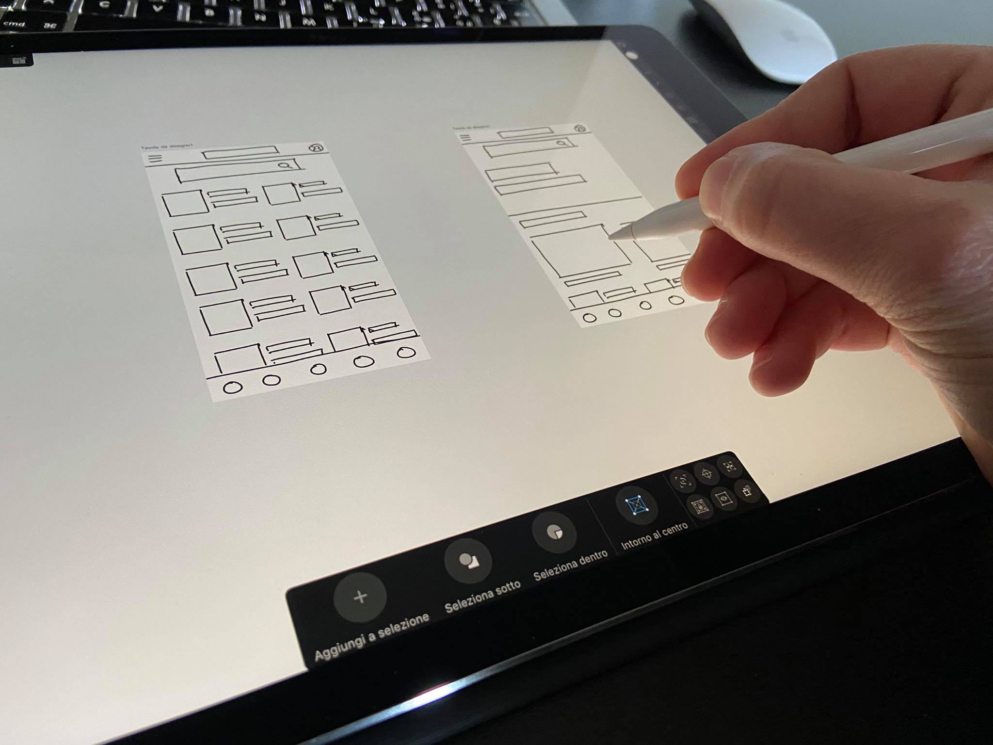
We have identified the opportunity to build/create a product with a specific focus on research and direct contact between musicians and event organizers. In conversations with the interviewees, we realized that providing a point of contact for the requests of music professionals can be an interesting exploration of design.
We decided to focus on creating a conceptual mobile app that would take advantage of searching by music genres and by geolocation, giving professionals the possibility to easily contact other music professionals on our network.
Develop:
prototyping
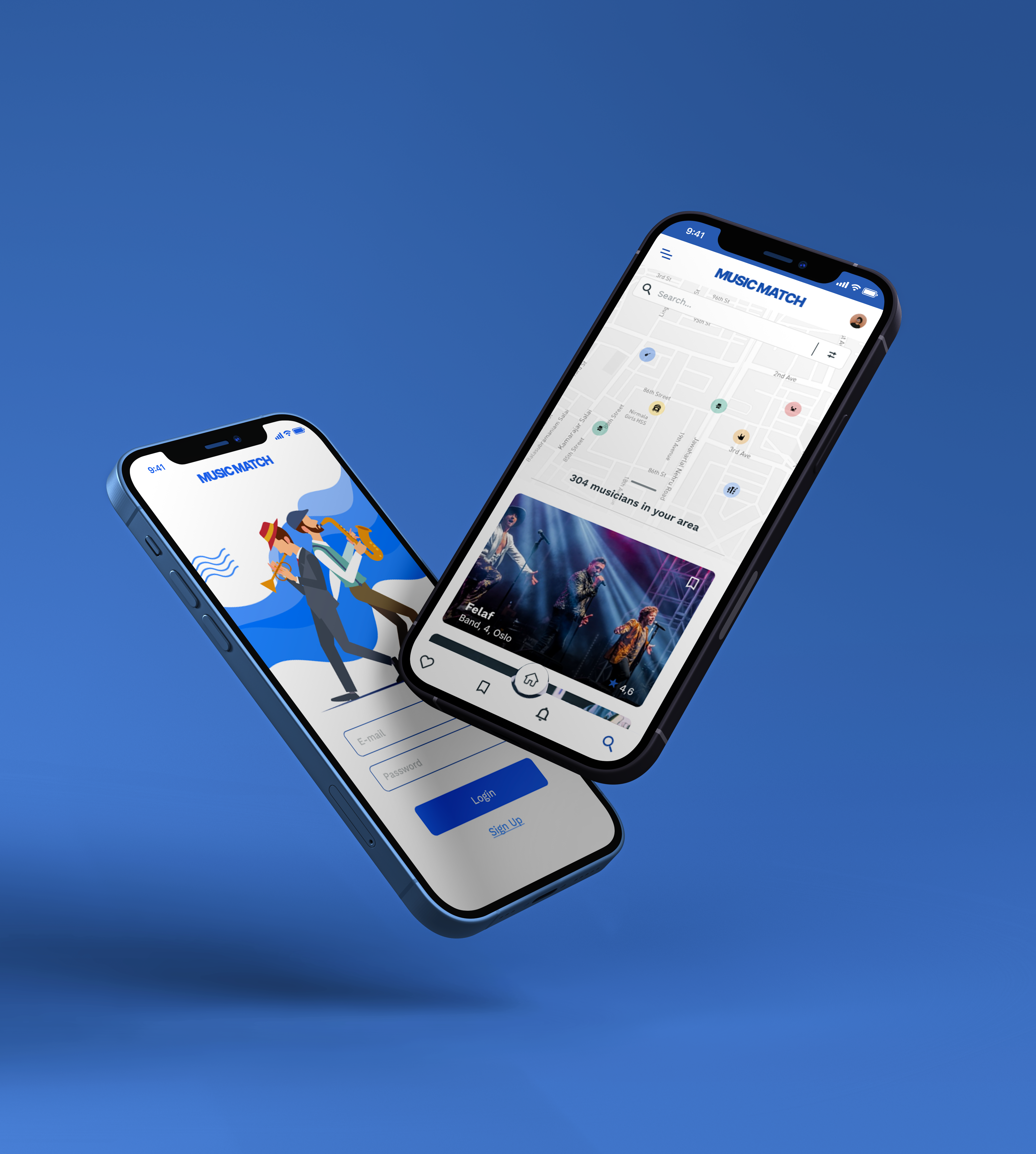
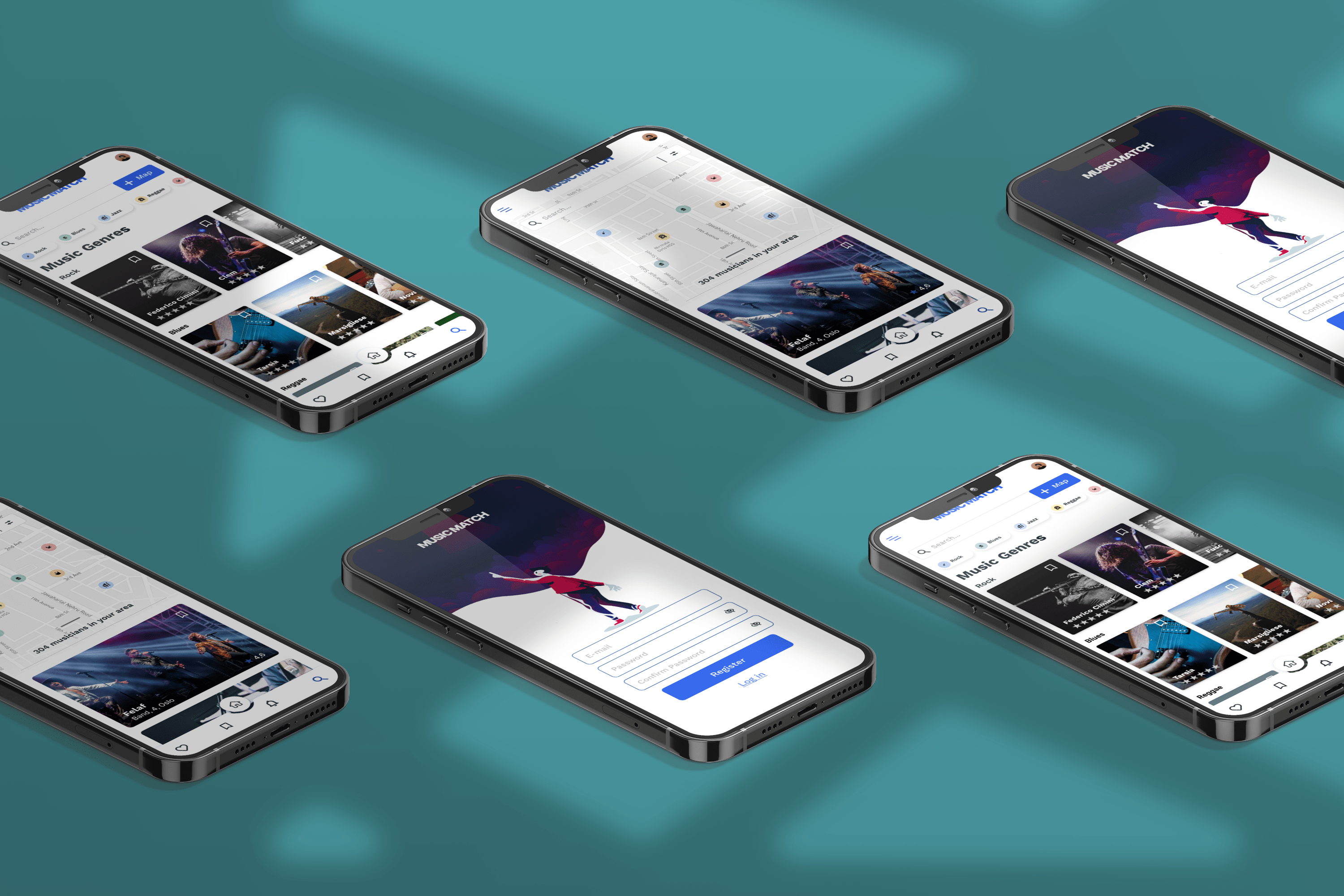
In the development of our digital product we have developed a high fidelity prototype to be submitted to music professionals, especially musicians and event organizers.
The prototype incorporates the main features:
A – Search by musical genres
B – Search by geolocation
C – Music Match
D – Professional documents section
Click here to see live prototype.
Test:
Validation, Usability, Feedback
In our validation tests, features A, C and D performed very well with 95% success rate. They The testers, also strongly agreed on value, accessibility and features.
Feature B received a number of positive responses and feedback (78%). Some answers were of uncertainty and difficulty in recognizing the feature (12% and 10%), which led us to believe that these features, after modification and iteration, would be even more valid for the final version of our app and the service.

design:
Iteration
During the testing phase, users were able to finish the flow smoothly and naturally. The only pain point users have encountered is the “Search by geolocation” view.
In this view, users could not immediately recognize the feature they were asked to test to continue the flow. Furthermore, the initial design has moved away from digital products already on the market and that users are used to using.
Our goal was to increase the success rate of flow termination users in a simple way.
After acquiring the A, C and D features, we decided to make some design changes to reduce the steps and friction in the search user flow by geo-localization, improve the overall navigation architecture by reducing redundancies in global navigation and improve the overall layout by means of the minimal design and card design.


Solution & impact overview
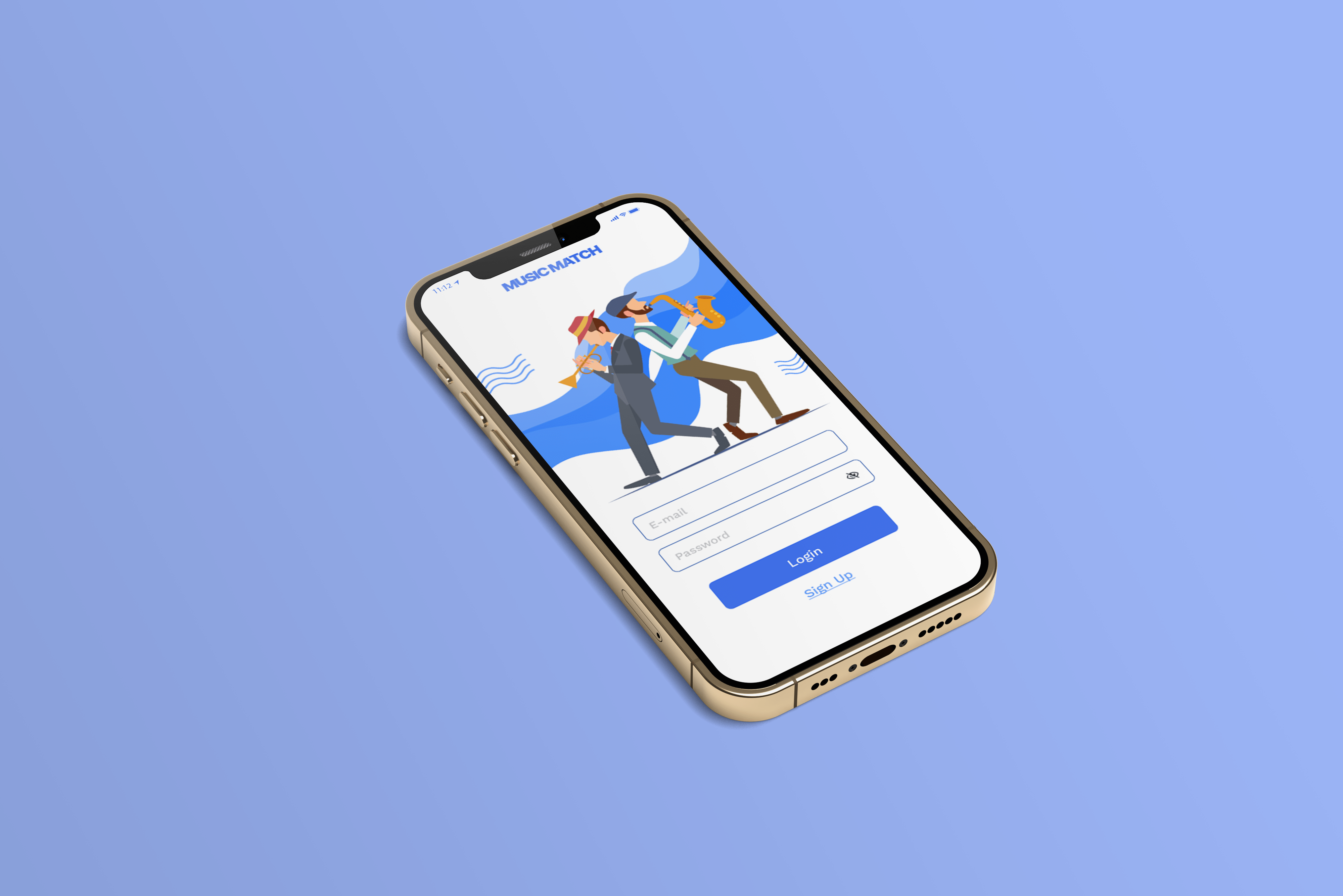
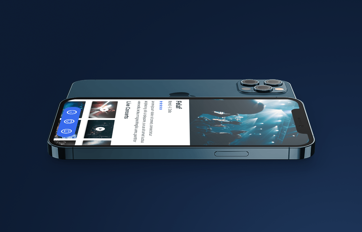
The best solution was to iterate the layout and make sure users were able to identify with some features they’ve already seen on the market and are used to using every day.
